Manage statistics using the GUI
This page describes how to manage the statistics using the GUI.
Using the GUI, you can:
View the statistics page
Procedure
From the menu, select Investigate > Statistics.
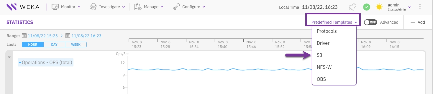
2. To view statistics of predefined templates for commonly used categories, select Predefined Templates and from the list select the required statistics template. The following predefined templates are available:
Protocols: System throughput breakdown by protocol access.
Driver: Throughput, latency, and OPS generated by native clients.
S3: Throughput, latency, and OPS generated by S3 clients
NFS-W: Throughput, latency, and OPS generated by NFS clients.
OBS: Throughput and latency generated while interacting with object store buckets.
Add a chart to the statistics page
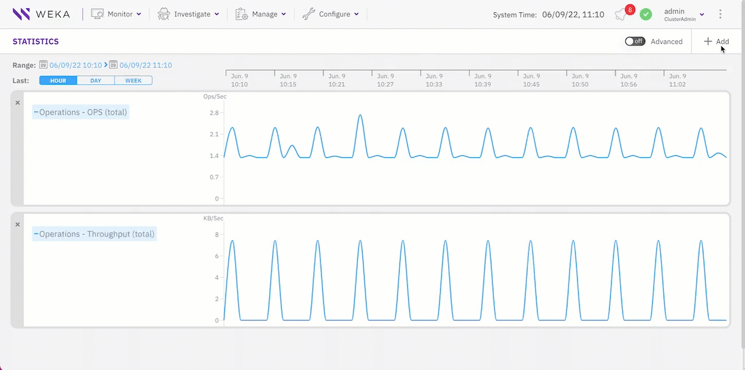
You can add charts to the statistics page to display up to a maximum of five charts.
Procedure
From the menu, select Investigate > Statistics.
On the Statistics page, select +Add.
In the Add Chart dialog, do one of the following:
From the Categories pane, select a category, and then from the Statistics Name pane select the required chart. You multiple charts (up to 5) at once. The number next to the category name indicates the number of charts already selected.
Search for a chart using the Filter. Type a keyword or two related to the chart, and then from the Statistics Name pane select the required chart.
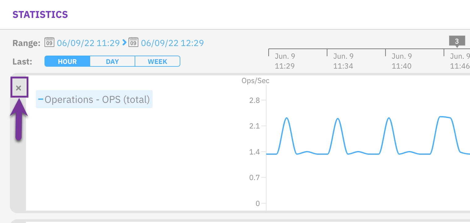
Remove a chart from the statistics page
You can remove a chart that is no longer required to free space for adding another chart to the statistics page. For example, if the Statistics page already has the maximum number of five charts.
Procedure
On the upper left corner of the chart, select X.
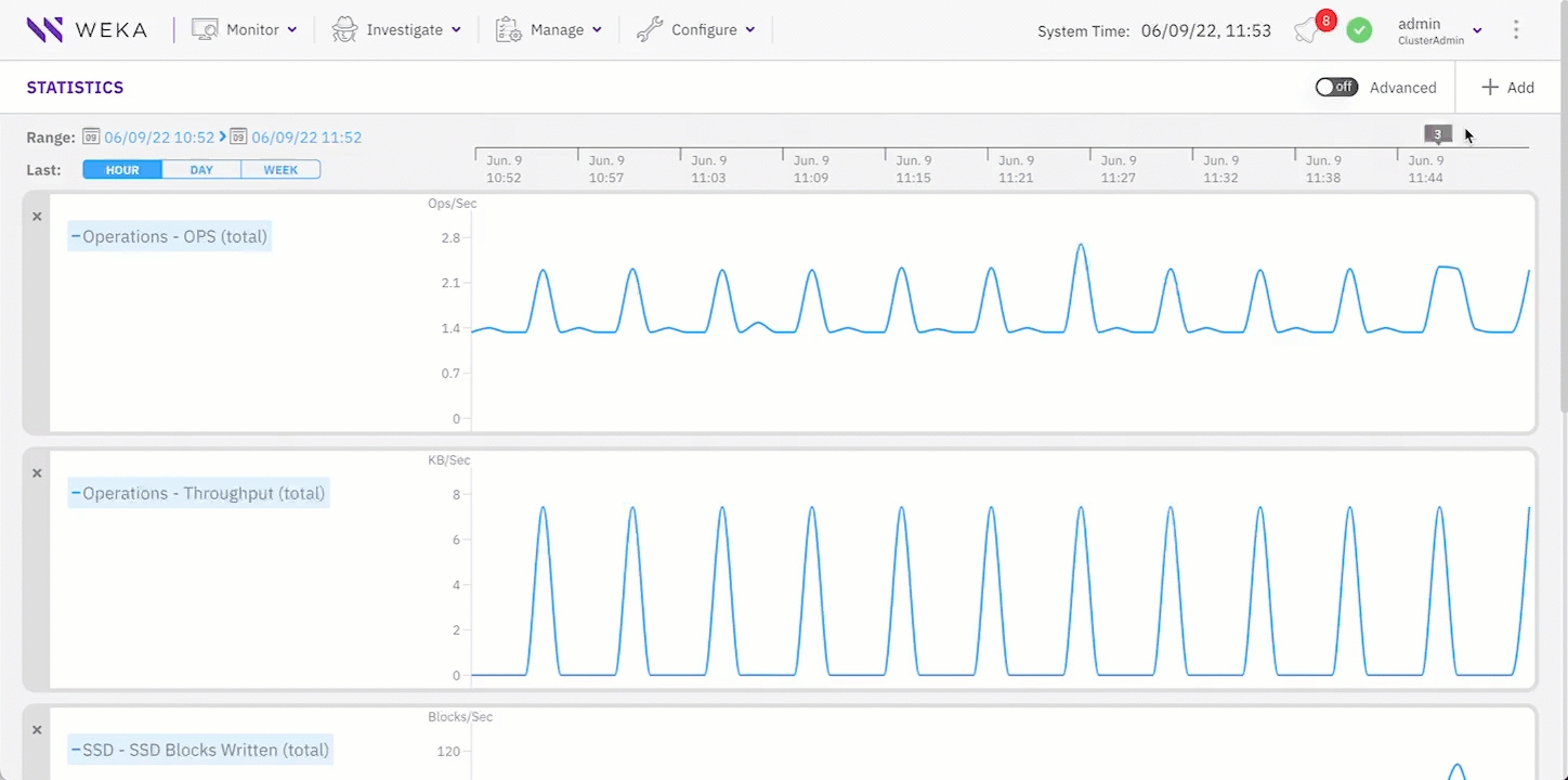
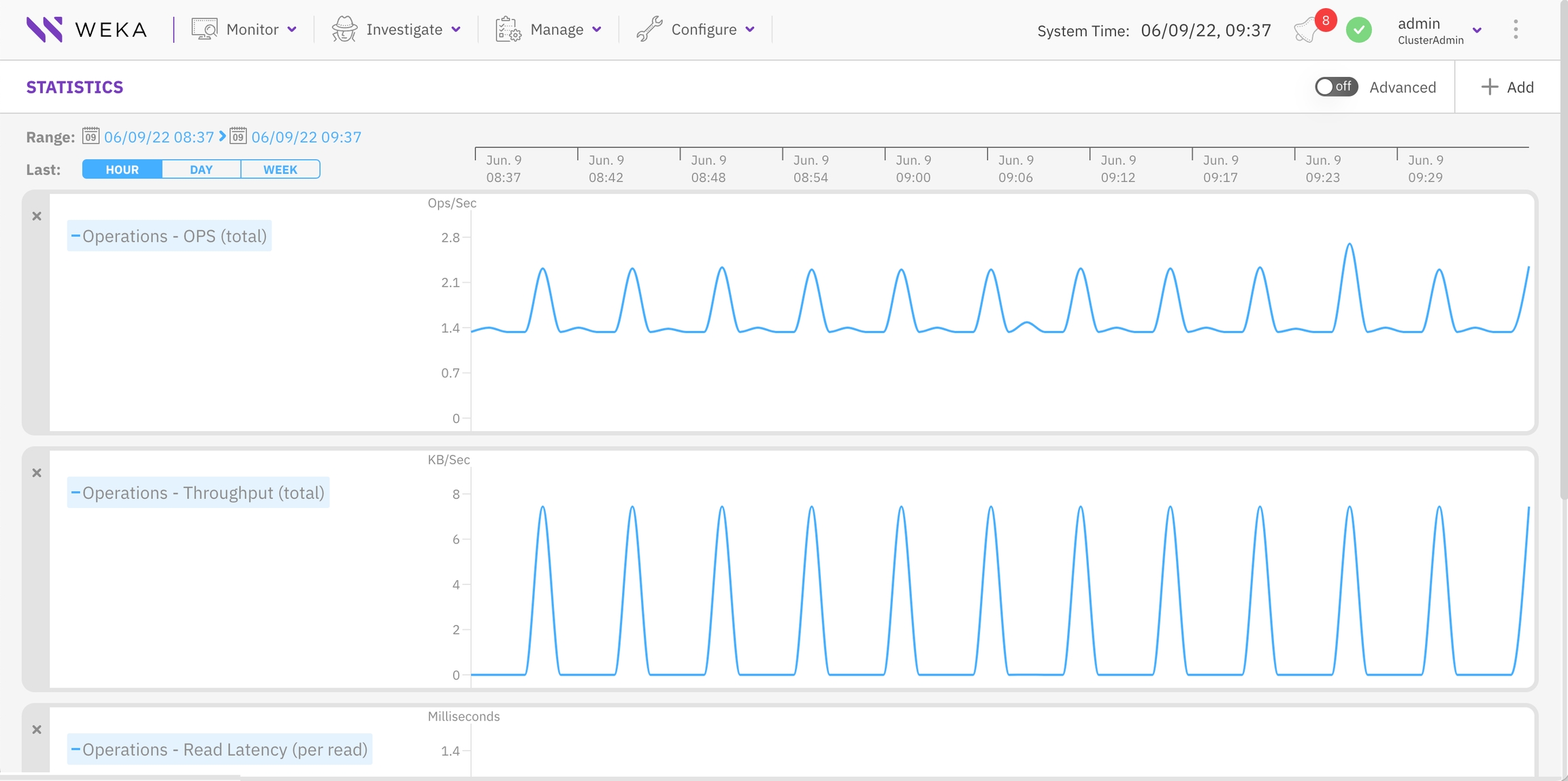
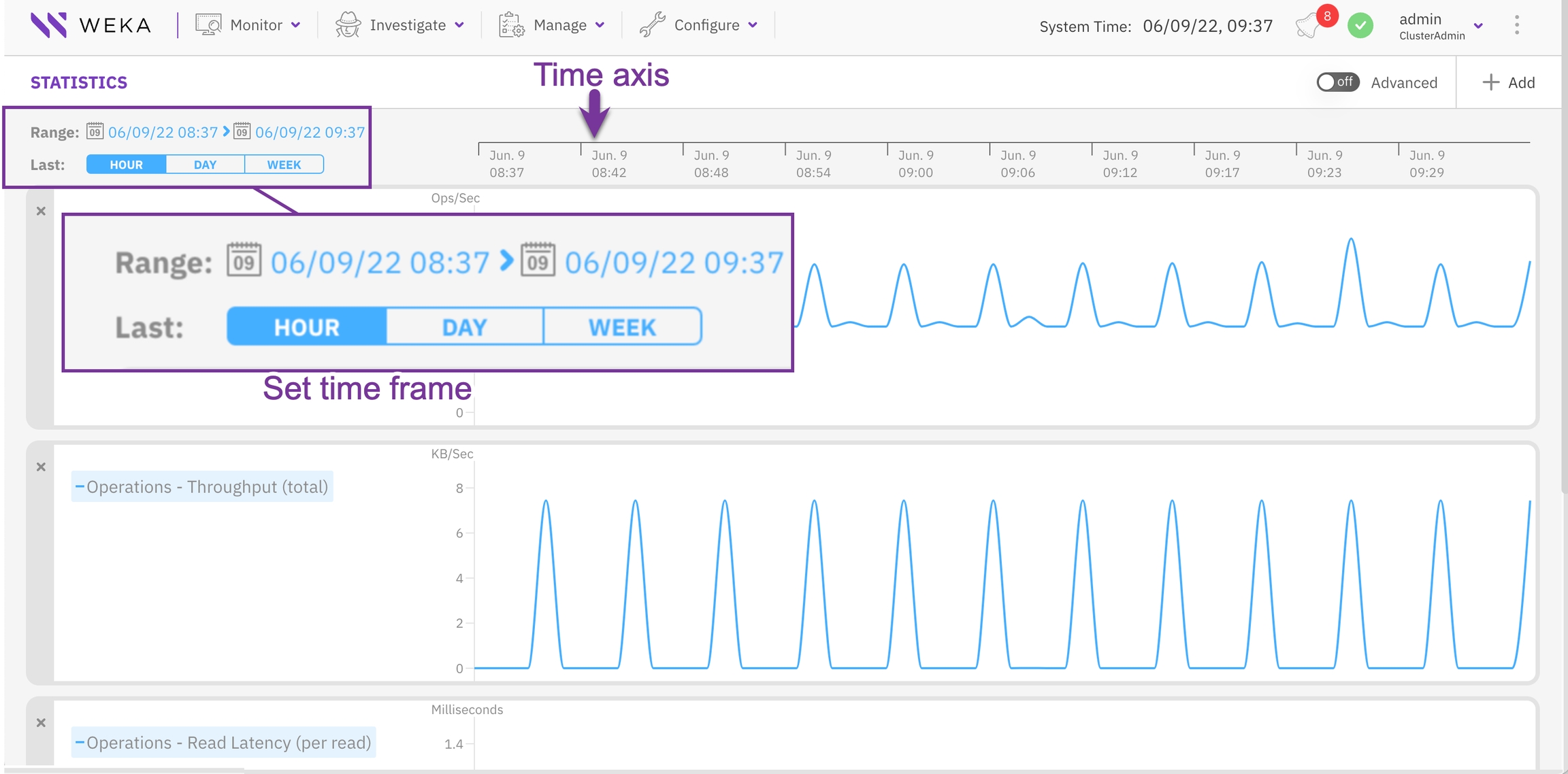
Set the timeframe
The Statistics page contains a time axis for all the displayed charts. To investigate charts in a specific timeframe, you can set the interval in the time axis to the last hour, last day, or last week. You can also set a timeframe for a specific period (start and end time).
Procedure
To display the charts for the last period: Hour, Day, or Week, in the Last line, select the relevant button.
To display the charts for a specific period, in the Range line select the calendar, and set the start time and end time for the timeframe.
Display events from a chart
If events occur during the period of the displayed charts, a purple box indicates the number of the events. To investigate the events, show and correlate them with the statistics data.
Procedure
On the time axis, select the purple box (it only appears if events occur).
From the popup box, select Show All.